


Menderes Belediyesi’nde harçlık dönemi
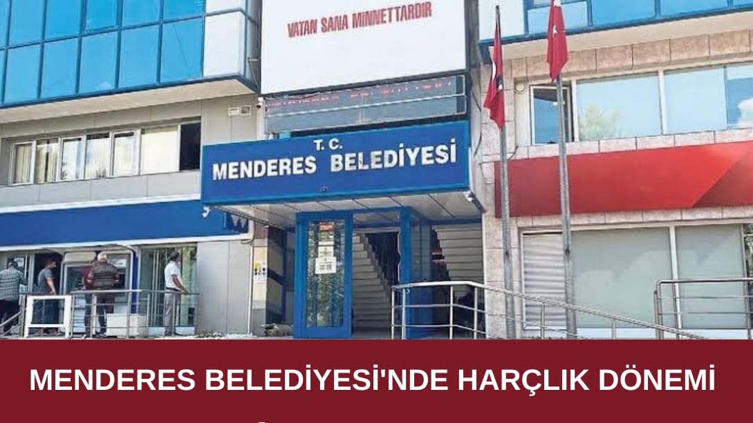
Gizem ÇETİNKOL – Gazete Ege / Geçtiğimiz haftalarda görevden almalarla gündeme gelen, Menderes Belediyesi bu sefer de maaşları ödeyememesi ile gündeme geldi.
İçişleri Bakanlığı’nın hakkında yürütülen soruşturma nedeniyle açığa aldığı ve halen yargı süreci devam eden Menderes Belediye Başkanı Mustafa Kayalar yerine gelen Belediye Başkanvekili Erkan Özkan’ın yönetim şekli gündemden düşmüyor. Açığa alınan Başkan Mustafa Kayalar’ın ekibine tırpan yapan Başkanvekili Erkan Özkan şimdi de belediye personeli ile karşı karşıya geldi.
Maaş ödemeleri ile ilgili sıkıntı yaşayan personel tabiri caiz ise harçlığa bağlandı. İddialara göre taşeron kadrosunda çalışan işçiler maaşlarını taksit usulü almaya başlarken, memurlarında 2 aylık ikramiyelerinin ödenmediği ve belediye içerisinde iç huzurun bozulduğu öğrenildi.
Menderes Belediyesi’nde geçtiğimiz dönem 450 kişi çalışırken, bu dönem personel sayısı 1200 kişiye yaklaşırken, geçtiğimiz günlerde 50 kişinin daha işe alındığı edinilen bilgiler arasında. İşe alımların devam etmesinden huzursuz olan personelin maaşlar ve ikramiyeler ödenemezken personel alımı yapılmasına tepki gösterdiği iddia edildi.
İLGİNİZİ ÇEKEBİLECEK DİĞER KONULAR
ZİYARETÇİ YORUMLARI
BİR YORUM YAZ